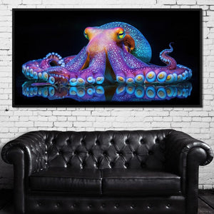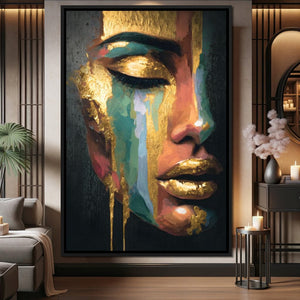
A dark room asks more of its art than a sunny one does. Whether you painted the wall deep navy on purpose or the room simply gets little daylight, the wrong piece sinks into the shadows while the right one becomes the first thing you notice. Choosing art for dark walls and low-light rooms comes down to five things you can check before you buy: contrast, palette, finish, placement and light.
This guide is about the art itself. If you also want to make the room brighter with paint, rugs, mirrors and fixtures, our guide on how to lighten up a dark room covers those fixes.
Start with contrast, not color
Every color has a value: how light or dark it is. In dim light, your eye keeps reading value after it stops reading color, so a saturated red turns muddy in a shaded corner while cream or white still reads from across the room.
That makes value contrast the first thing to check when you choose wall art for a dark room. Two quick tests:
- Squint at it. Squinting blurs detail and color. If the piece becomes one gray blur, it will do the same on a dim wall.
- View it in black and white. Photograph your wall in mono, then view the product image the same way. If art and wall land on the same gray, the art will disappear.
The rule: the darker the wall or the dimmer the room, the more light area the art needs.
How to choose art for dark walls
Navy, charcoal, forest green and black walls can make art look richer than a white wall does. There are two ways to work with them.
Light art on a dark wall
The high-contrast route: pick a piece with a pale ground (cream, ivory, soft blue or blush) and let the dark wall act as a frame. Golden Breeze Over Indigo Sea is a good example, with pale cream and sky blue crossed by gold veins and passages of deep navy. On a navy wall, the dark passages tie the piece to the paint while the light areas carry it. It comes as a single canvas from 16x12 to 48x36 inches, or as a 5-piece gallery wrap set in 60x32 or 80x40 inches.

Dark art on a dark wall
The moody route: choose art with a black background so its edges melt into the wall and only the subject stands out. In White Petals Night Blossom, a large white bloom shaded in charcoal sits on a black ground between pale gold leaves. On a charcoal wall the background all but vanishes and the bloom seems to float.

The catch: without a lamp or picture light aimed at it, dark-on-dark reads as a black rectangle.
Palettes by wall color
- Navy: cream, white, gold, pale sky blue, and rust or orange, which sit opposite blue on the color wheel.
- Charcoal and black: ivory, gold, amber, and black-and-white images with bright whites.
- Forest or olive green: blush pink, terracotta, cream and gold.
- Burgundy: cream, soft pink, gold, and black and white.
Test a pairing by holding your paint chip next to the product image: the art's lightest areas should be clearly lighter than the chip.
Choosing a painting for a dark room
A low-light room is a different problem. The walls may be white, but north-facing windows, a basement or one small window leave everything a little gray, so you want art that holds up in weak, often cool light.
- Pale grounds. Watercolor-style art often keeps a white, paper-like background, so it stays bright when the room doesn't. Many pieces in our watercolor collection sit on light grounds; skip the ones set on navy or black.
- Landscapes with a bright sky. A horizon with light in it works like a second window. Pastel Sunrise Over Lake Fjord, with its pink and lavender sky reflected in still water, opens up a windowless wall. See more landscape art.
- Black and white with real whites. Strong black-and-white photography keeps its punch in low light because it is built on value contrast. Browse our black and white collection.
- Warm tones for cool light. North light leans blue-gray; peach, coral, honey and gold in the art balance it.

Night scenes, dark fantasy art and very fine detail struggle in a dim room. Save those for walls you can light well.
Gold accents: what they can and can't do
In a canvas print, gold is part of the printed image, not leaf or foil, so it won't scatter light around the room the way a brass lamp does. Instead, it reads as the warmest note on a dark wall, especially under warm lamp light, and echoes any brass hardware nearby.
Abyssal Echoes in Gold Abstract by Tanni Cylon pairs a black half with an ivory half, crossed by a ring of gold and copper. On a charcoal wall the black side recedes and the ivory and gold carry the piece. For more, browse our gold wall art. One or two gold pieces per room look intentional; a whole wall of them starts to compete.

Gallery wrap, black frame or white frame?
We offer three finishes: gallery wrap (the image runs to the edges, no frame), black floating frame and white floating frame. On a dark or dim wall, the finish changes how the art sits.
- Black floating frame on a dark wall: the frame disappears into the paint, so a light image seems to float like a window. The safest pick for navy, charcoal or black walls.
- White floating frame on a dark wall: a crisp, bright outline. It suits graphic art and black-and-white photography, but around mid-tone art it can become the brightest thing on the wall.
- Gallery wrap: no border at all, which suits dark-ground art and multi-panel sets.
- White wall in a dim room: flip the logic. A black frame marks the edge so a pale piece doesn't blur into a wall that already looks gray.
Canvas is normally hung without glass, so you avoid the mirror-like reflections a glazed frame picks up from a lamp or window. For a fuller comparison, see gallery wrap vs. floating frame.
Placement: work with your windows and lamps
In a dark room the eye goes straight to the brightest spot, so put the art there or bring light to it.
- Skip the window wall. Art beside a window is seen against the glare, and that wall sits in its own shadow.
- Use the facing or side walls. The wall opposite a window gets the most daylight; a wall at a right angle gets softer side light.
- Avoid long sun streaks. Direct sun hitting the same spot for hours can fade any printed art over time.
- Put art where the lamps are. A table lamp on a console below the art, or a floor lamp beside the sofa, washes the canvas with light.
- Hang at eye level. Center the piece 57 to 60 inches from the floor, or keep the bottom edge 6 to 8 inches above a sofa or console.
Our guide to common hanging mistakes covers height, scale and spacing in more detail.
Picture lights and other ways to light the art
If the wall stays dim even with two or three lamps on, light the art directly:
- Picture light: a slim fixture above the piece, about half to two-thirds its width. Plug-in and battery LED versions need no electrician.
- Adjustable ceiling spot or track head: aim it about 30 degrees from vertical, the angle lighting designers use to limit glare and frame shadows.
Bulb color matters too. A warm 2700K bulb flatters gold, amber and red; a slightly cooler 3000K to 3500K bulb keeps blues and whites from turning yellow. A bulb with a CRI of 90 or higher shows colors more accurately.
Go bigger and simpler
Low light flattens detail first. A small, intricate print becomes a gray smudge from across a dim room; a large piece with bold shapes still reads.
- Choose one large piece over a cluster of small ones, which tends to look busy in shadow.
- Above furniture, aim for art about two-thirds to three-quarters the width of the sofa, bed or console below it.
- For long walls, consider a multi-panel set. On a dark wall the gaps between panels show as dark lines, which suits flowing abstracts and seascapes. Our abstract art collection includes many designs offered as 5-piece sets.
Every piece arrives ready to hang with the hardware installed, so trying a new spot takes minutes.
FAQ
What color art looks best on a dark wall?
Art with plenty of light value: cream, ivory, white, pale blue or blush, often with gold accents. Dark-background art works too, but only if you light it.
Should I choose a black or white frame for a dark wall?
Black is the safer choice: it blends into the wall and lets the image float. White suits graphic or black-and-white art but can overpower mid-tone pieces.
Will wall art make a dark room brighter?
Art doesn't add light, but a light-toned piece reflects more of the light already there and gives the eye a bright focal point, so the room feels less gloomy.
Where should I hang art in a room with only one window?
On the wall facing the window or on a side wall, not beside the window. Then add a lamp or picture light so the piece stays visible after dark.